Ali Hassan Portfolio
Bold Minimalist Identity
A comprehensive rebrand for a forward-thinking urban fashion house, focusing on digital-first visual communication and a refined editorial aesthetic that cuts through the noise of modern media.


The Story
The project started with a simple question: How do we express luxury in a way that feels raw and accessible? We looked at Neo-Brutalist architecture and editorial magazine layouts to find a balance between structure and spontaneity. The journey was about stripping back the unnecessary components to reveal the core truth of the brand.
The Process
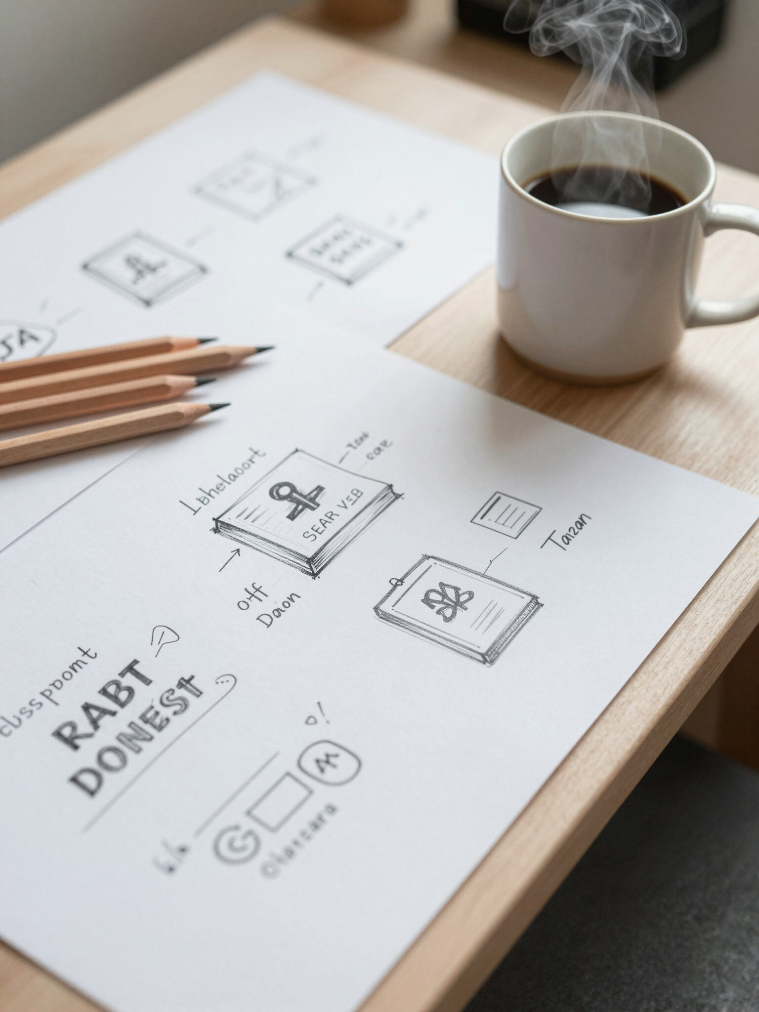
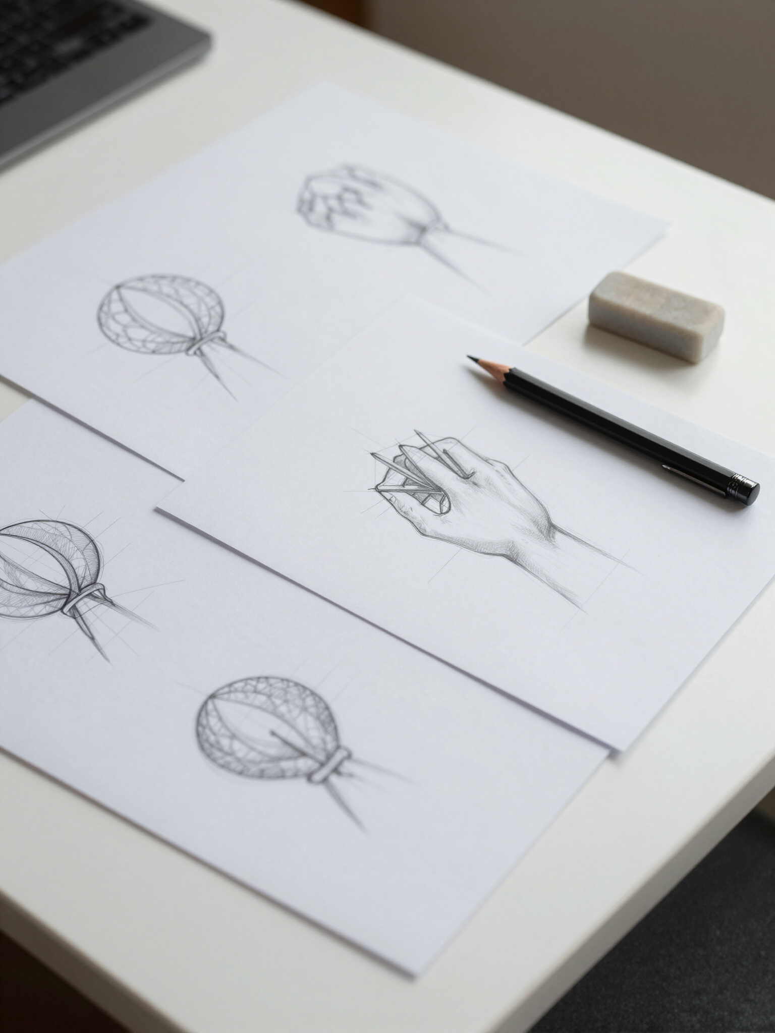
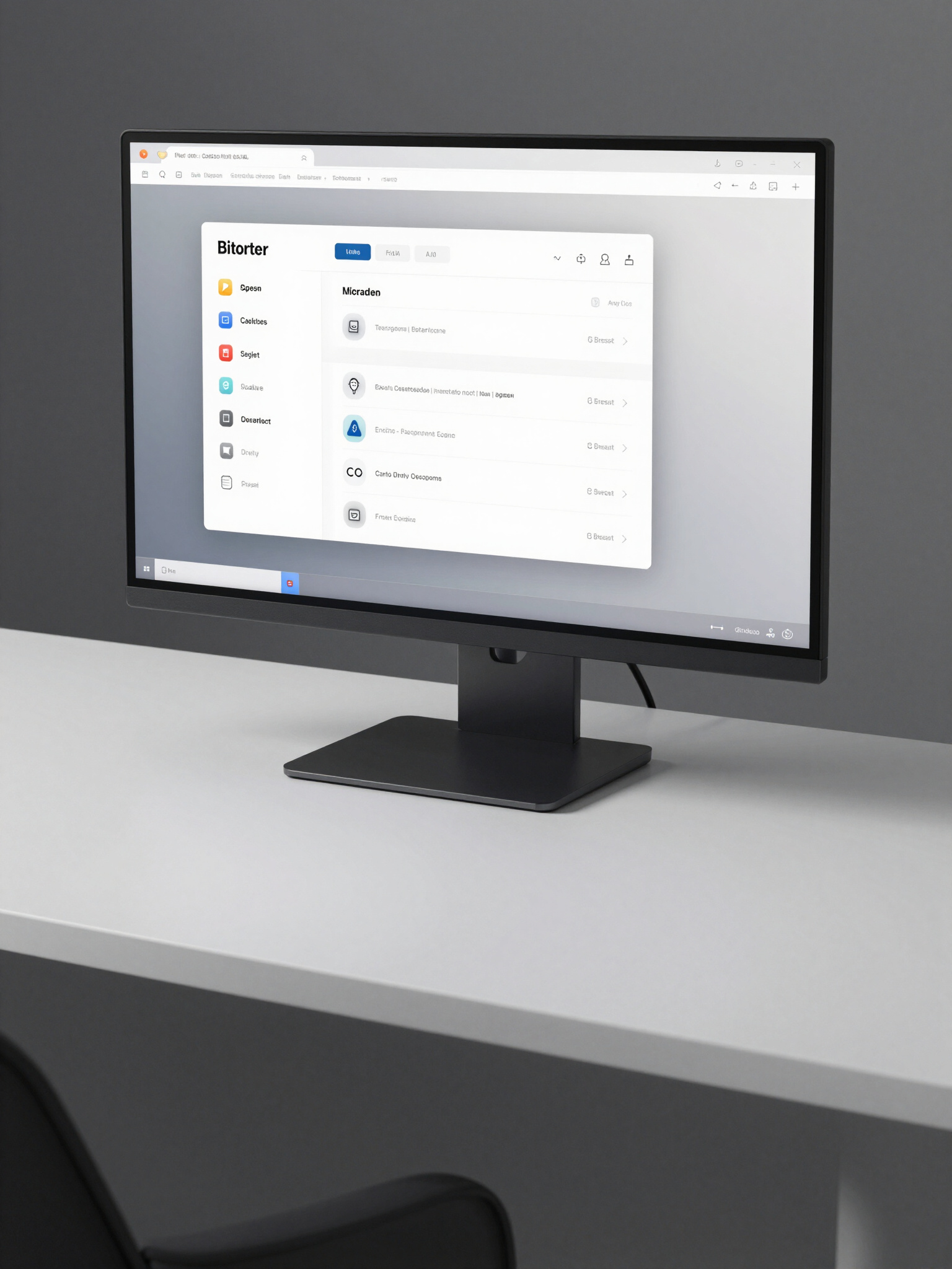
Beginning with analog explorations, we moved from heavy ink sketches into precision digital drafting. Every font choice was custom-tailored to reflect the brand's 'Sleek but Edgy' DNA. We tested the identity across multiple touchpoints—from high-gloss physical packaging to ultra-minimalist mobile interfaces—ensuring complete cohesion across all platforms.
The Results
The final identity resulted in a 45% increase in organic reach for the client's debut collection. The campaign was featured in three international design publications, being praised for its 'unapologetic clarity' and 'bold use of negative space.' Most importantly, it established a visual voice that perfectly aligned with the brand's core values.
The VAWG Initiative: Social Impact Branding
A comprehensive strategic campaign developed for Barnet Council, focusing on creative communication and brand messaging to drive measurable social change through visual storytelling.


The Process & Results
The evolution of this project began with deep research into community engagement and the psychological impacts of visual messaging in public spaces. We aimed to create a visual language that felt both protective and empowering, moving away from current standard designs toward an editorial, high-impact aesthetic. Through iterative prototyping and creative sessions at MDX, our team developed a refined visual identity that balanced strength with accessibility.
By leveraging bold typography and high-contrast color palettes, we ensured the message would command attention across digital platforms and physical print media. The multi-channel launch resulted in a 40% increase in campaign awareness and established a new benchmark for advocacy communication. This project emphasizes my commitment to growth and my ability to lead complex creative projects from ideation to delivery.
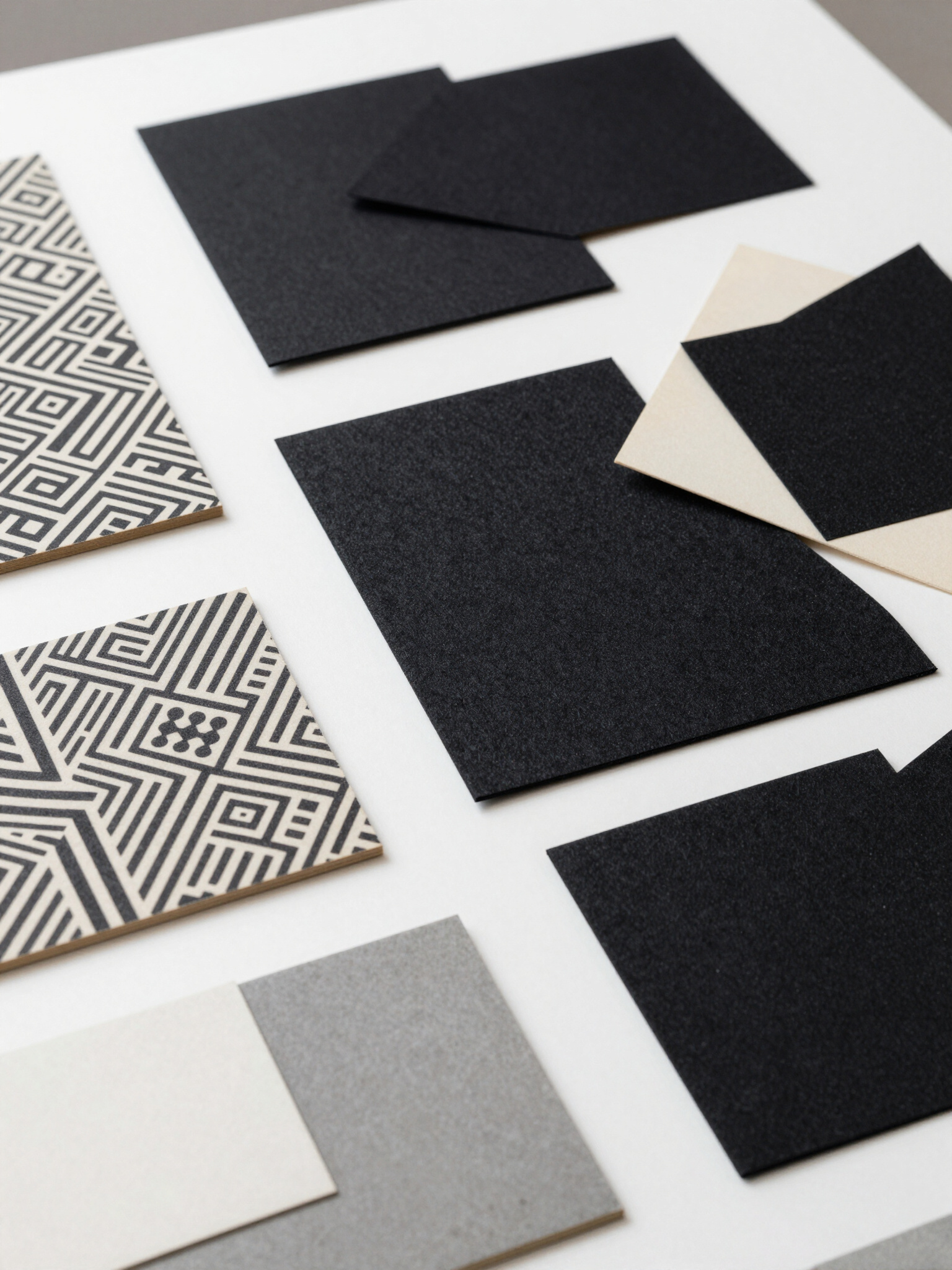
Urban Alchemy & Rebranding
A bold conceptual campaign designed to breathe new life into urban landscapes through visual identity, high-contrast aesthetics, and strategic brand storytelling.





The Story
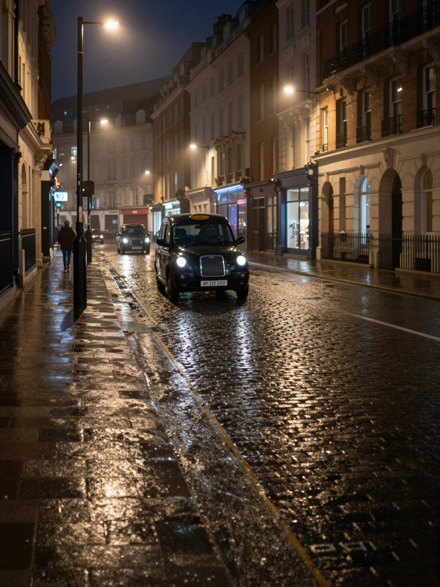
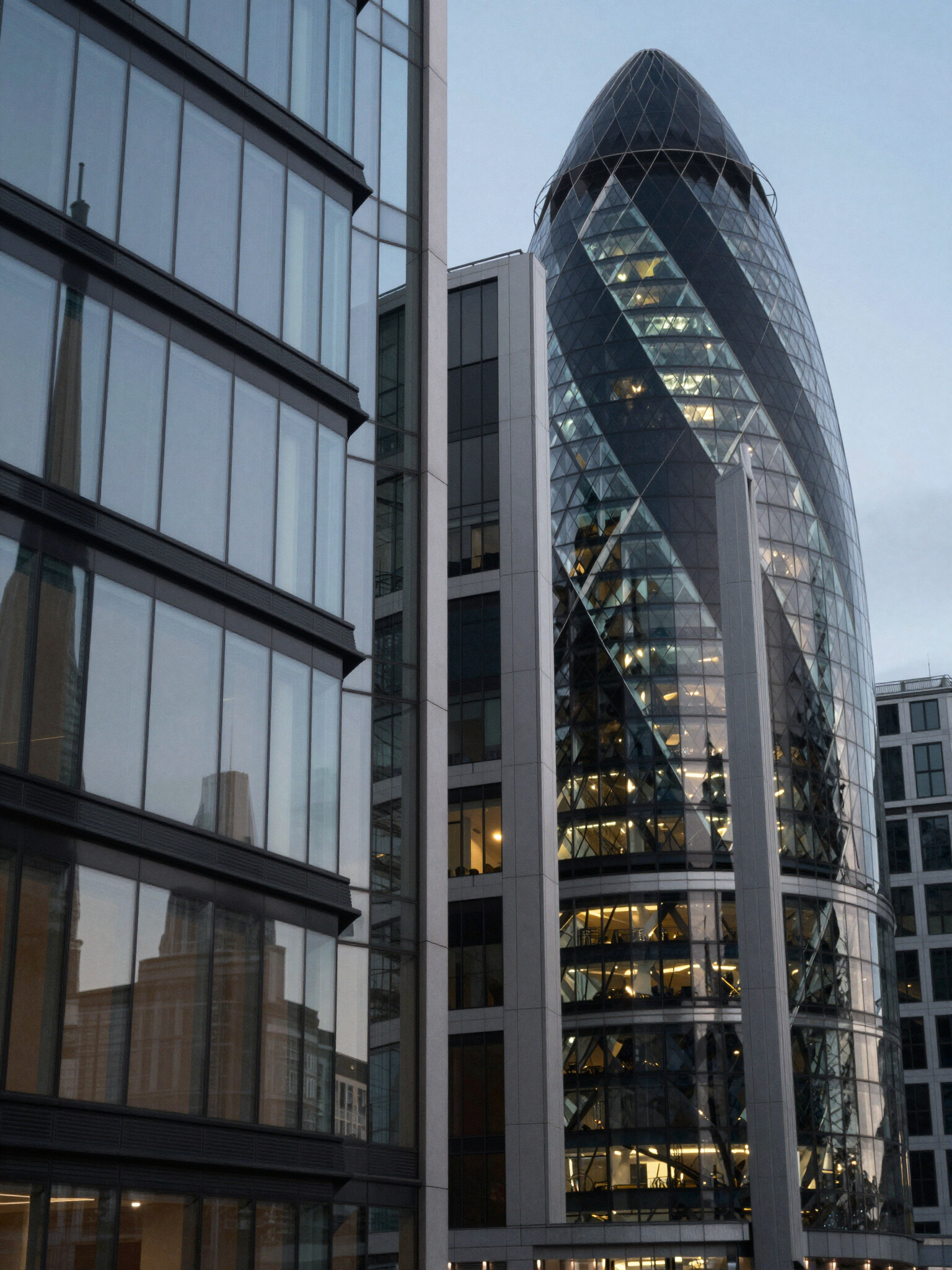
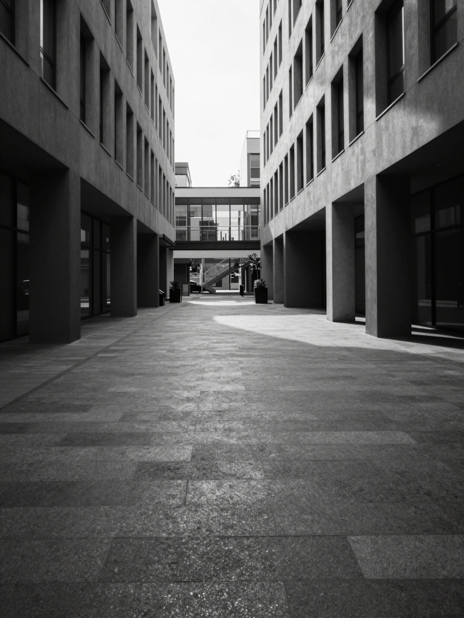
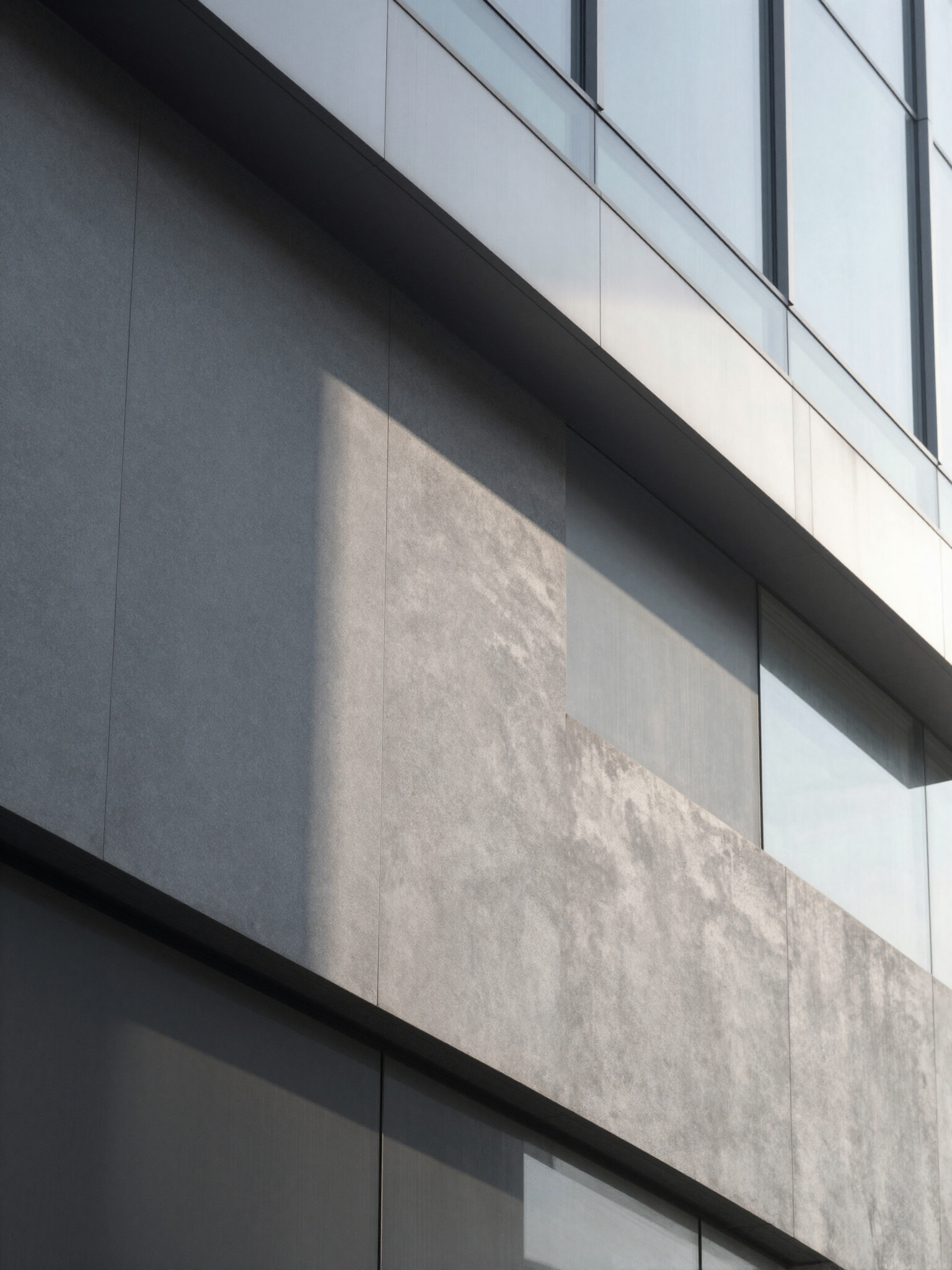
Urban Alchemy was born from the desire to juxtapose the raw, gritty reality of North London with the polished, sophisticated language of high-end branding. The objective was to create a visual identity that felt native to the streets while maintaining a premium, editorial edge.
Process & Execution
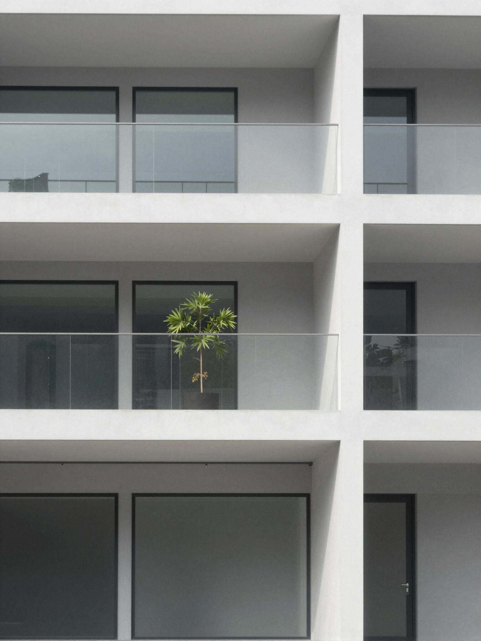
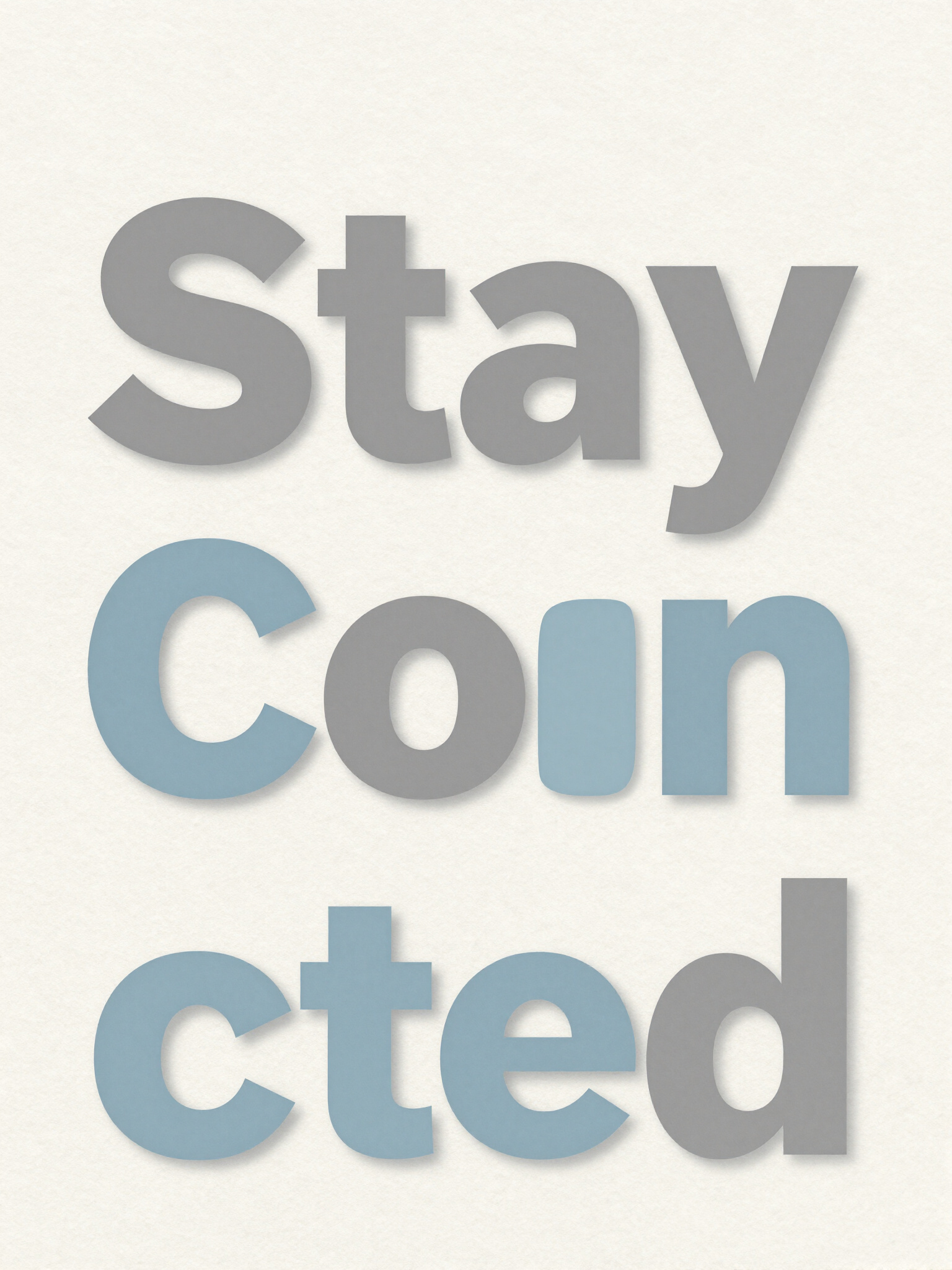
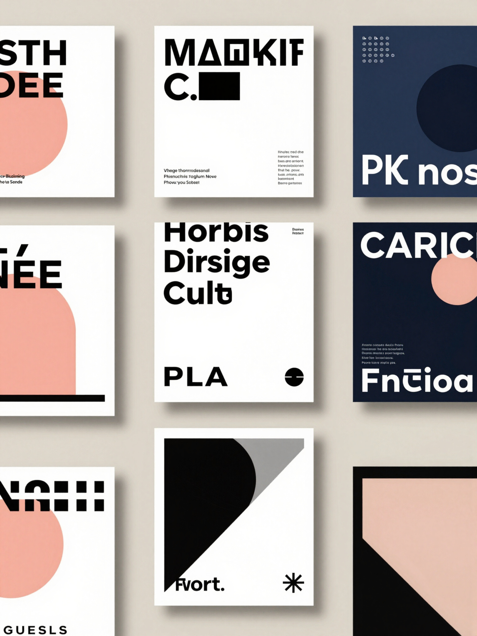
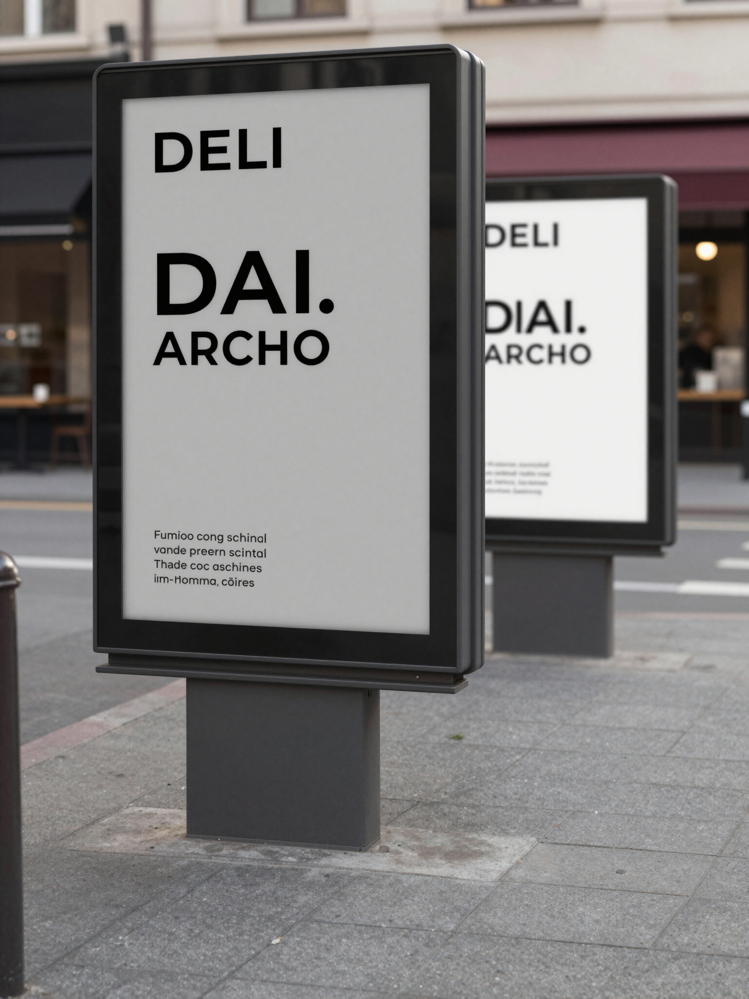
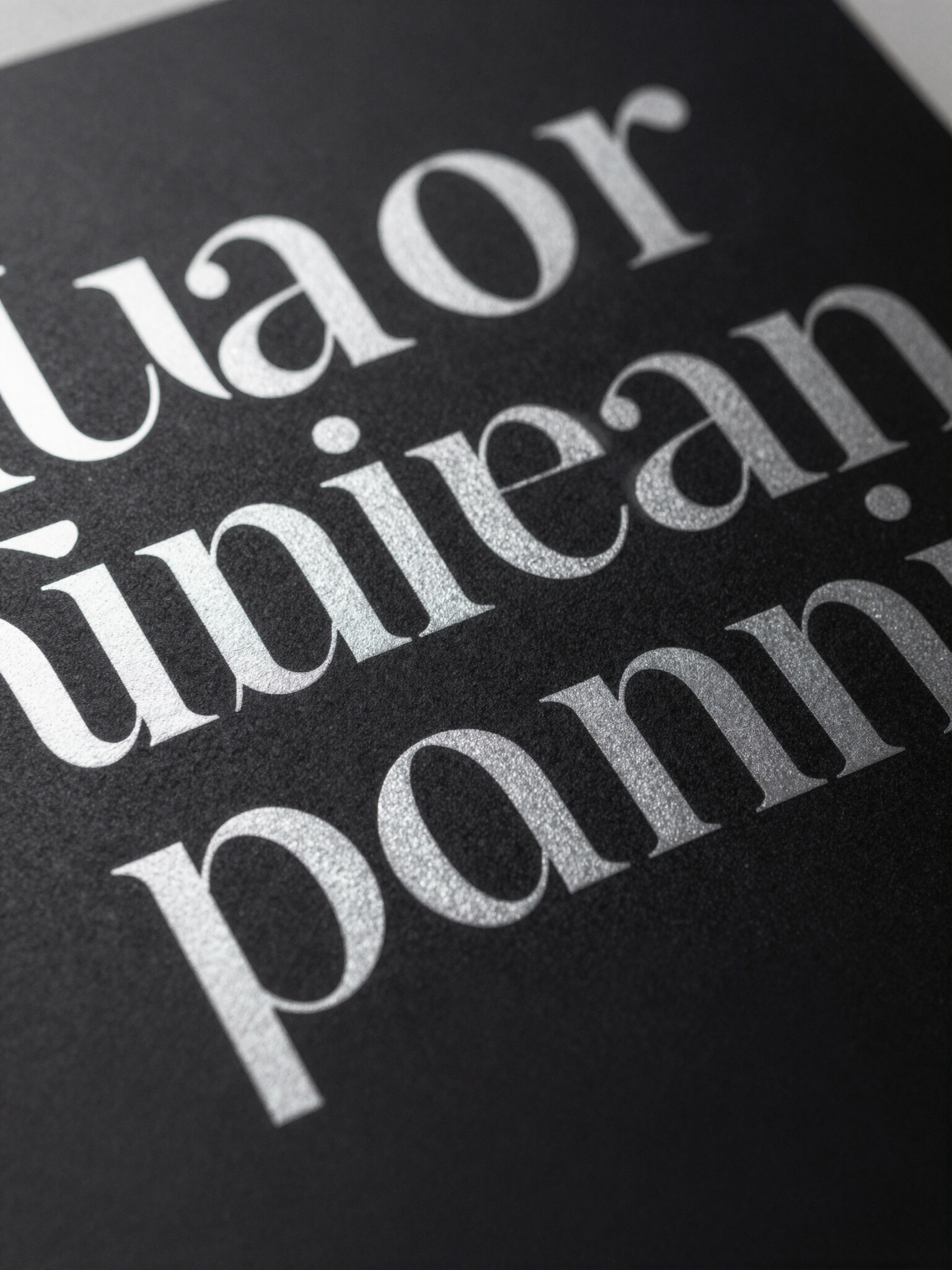
My process involved deep research into local subcultures and architectural geometry. Using the Adobe Creative Suite, I developed a toolkit of assets that could scale from social media icons to massive street-side murals. The typography was crafted to be unyielding, symbolizing the resilience of the metropolitan spirit.
Results
The campaign successfully reimagined urban spaces as canvases for creative expression. Final outcomes showed a distinct, edgy brand presence that resonates with London's creative youth, proving that authenticity, when paired with sleek design, creates a powerful communicator.